Users, upon first encounter with an app – spend an average of 30 seconds exploring it before closing it. Those 30 seconds will decide whether or not the user will open your app a second time.
No mercy.
They don’t care about the blood sweat and tears invested in getting an app from sketches on a napkin to the store. And they don’t care about that really sweet transition between carefully designed buttons buried 3 screens into a user journey. At least not in the first 30 seconds they don’t.
As designers we tend to browse apps and judge them on the behind the scene details that users will never focus their attention on. “Those line weights are completely wrong in this list view…” “Oh I love that shade of off-white.”
That is the designer’s critique. This is the users critique. We chose Wayfair, a home decor sales catalog. Admittedly searching for things we liked, here’s what we decided in 30 seconds:
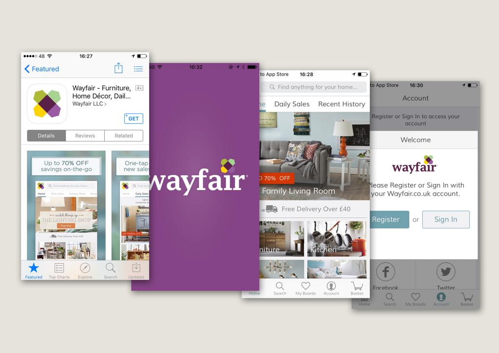
App Icon – unusual color palette (when “unusual” is a compliment because that can always go both ways) … like it.
Apps store screen shot – deviated from the norm with a an edgy heading style over the screenshots, straight to the point with “70% off”… like it.
Launch Screen – vibrant. (when we are not completely certain that “vibrant” is a compliment)
Home Screen – efficient use of the navbar as the search bar.
Account Tab – “Please register…”. I didn’t have to register before getting to explore the product, and now I understand and appreciate why they want me to register… love it.