Back in the olden days (we’re talking iOS 6) gradients acted as an offensive weapon in app design. Battling the delightful user experience with thick heavy gradients, they worked to give items a third dimension but succeeded only in making them “realistic” but quite ugly looking.
In recent times (iOS 9/10), gradients have been revamped and accepted into society once more, bringing a bit of life and vitality into app design.
A few ways gradients now behave on behalf of the greater good…
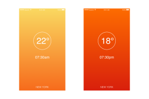
A gradient creates new colours in between points, expanding your colour palette in a natural, easy way.
Collecting and creating images for your design is sometimes tedious. When the content is exactly what you need, but the colour or look and feel just isn’t… hello lovely gradient!

Gradients provide sturdy support for minimal interface design.
In one foul swoop, a gentle gradient can create a strong mood or feeling.

A useful links in getting the brain ticking over..
Also published on Medium.