I’m a graphic designer. I use blend modes all the time. The trial and error method I use has 2 types of results.
Result A: A surprise image that drives your design concept forward.
Result B: Your shielding your eyes and recoiling in shame from the abuse you have just given your beautiful photograph. You’re also praying to God that no co-worker chose that moment to stroll past your screen.
Whilst not knowing which to expect keeps me on my toes, it is also time consuming. Therefor I have summarised and briefly described what each blend mode does. Did you know they are broken down into categories?
We don’t need to know the maths, that’s just boring. We simply need to be mentally prepared for whichever result we may achieve!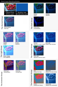
- Normal
Does what it says on the tin. Booooring.
The Dark Group
- Darken (Dark)
Keeps the dark pixels and blends the lighter pixels with tones of the colour below
- Multiply (Darker)
Not only Keeps the dark pixels , it multiplies them.
- Color burn (The Darkest)
The darkest of this bunch.
The Light Group
These ones are the opposite of the above group and will generally lighten your image
- Lighten (Light)
Keeps the pixels that are lighter than the ones in the underlying layer. It blends the the darker pixels with the ones in the layer below.
- Screen (Lighter)
t’s great for making blacks disappear and creating glows
- Colour Dodge (The Lightest)
The lightest of this bunch.
The Contrast Group.
- Overlay (Based on Lower Layer)
Based on the brightness of the underlying layer, the midtones become transparent.
- Soft Light (Softer than Overlay)
The highlights become transparent .Works similar to overlay mode but with softer results.
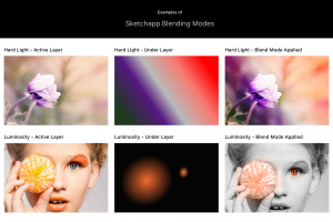
- Hard Light (Based on Active Layer)
Based on the brightness of the active layer, the midtones become transparent, producing the most intense results in this bunch.
The Inversion Group
- Difference (Using Black)
Black does not invert. White does. Similar colours cancelling each other out and get replaced by grey.
- Exclusion (Using Grey)
Similar to the difference mode except similar colours cancelling each other out and get replaced by grey.
The Component Group
In summary, all images contain these four components. Each group here retains that one component and blends the others
- Hue (Keeps the Hue)
Keeps the hue and blends the luminance and colour from the top layer.
- Saturation (Keeps the Saturation)
Keeps the saturation of the active layer and blends the luminosity and hue from the underlying layer.
- Colour (Keeps the Colour)
Keeps the colour of the active layer and blends the hue and saturation with the luminance of the lower layer. It ’s a quick way to change the colour of an image.
- Luminosity (Keeps the Luminance)
Keeps the luminance of the active layer and blends the hue and colour of the lower layer.
 Also, don’t be afraid to test out multiple filter layers with gradient and patterned fills and turn the opacity up and down! Once you get used to what each one does, you’ll be making the most of your images in no time at all!
Also published on Medium.